 When you walk into a store, you often have an idea of what you want to buy. In a market, you usually walk to a certain section – let’s say the soup aisle. As you are perusing all the cans of soup, you’ll start seeing different brands and flavors, but which one will you pull off the shelf?
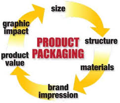
In all likelihood, you’ll choose the one with the best product design – the one with the smartest typography and the best photography. It’s pure psychology. Even the newest product on the shelf can sell out in a single day if the product design is incredible. Product packaging is also important for sales kits – to convince retailers to carry your product. Here are 4 factors to consider when designing product packaging.
- Color. Color is imperative when designing product packaging. Loud or quiet – it doesn’t matter what direction you go in, but you do want to go in a concrete direction. If you look at any great product design, it has at least one splash of color – even if it’s only in a single letter. When it comes down to it, color creates a mood and a feeling. If you are selling perfume – you want the colors to illuminate and elicit certain emotions.
- Shape. Shape is another critical part of product design. Sure, some products may be limited to a certain shape. For instance, if you are selling a bottled beverage, you pretty much have the contours of a 750ml bottle to work with. However, you can always push the boundaries a little further. For instance, you can make the neck of the bottle a little longer – you can also add some kind of design element to the glass. In an aisle full of other bottled beverages, the one with the most interesting shape will stand out the most.
- Typography. One of the most important elements of product packaging is typography. When it comes down to it, you don’t need anything too wild or out there. In fact, if you get too liberal with the product typography, it may be difficult to read. So, how do you make typography interesting? You need to explore and visit thousands of fonts and typefaces. Eventually, you’ll find something that stands out – something that is more unique and gives your product a visual edge that is sharp and impressive. Even if you choose a simply sans serif treatment, it can still jump out at you.
- Photography. Most products are completely covered, so shoppers don’t really know what’s inside. You can assume that a can of soup has soup inside of it, but what does the soup look like? What does the person eating it feel like when he or she is eating it? These are all things you can capture in a single photograph.
- Not only does the photograph need to be well shot, but also it should paint a perfect portrait of what somebody will feel like when they buy the product. In the end, even if your product costs fifty cents – the photograph should give the impression that your product is worth fifty dollars. It isn’t so much about money well spent as it is about an experience well had.
- [“source-businessmerch”]


